[MainProject] 커스텀 그림판 색상 변경

그림판 색상 변경 버튼
커스텀 페이지에서 그림판 색상 변경 구현을 위한 그림판 색상 변경 버튼 구현
버튼 레이아웃
각각의 버튼들은 .tsx파일로 5개로 만들어 CustomContent.tsx에 다음과 같이 import하였다.
//ColorInputStyled.ts
import styled from "styled-components";

export const ColorInputStyled = styled.input.attrs({
  type: "color",
})`
  position: relative;
  z-index: 20;
  height: 25px;
  width: 40px;
  border-radius: 20px;
  margin-left: 30px;

  &::-webkit-color-swatch {
    position: absolute;
    width: 100%;
    height: 100%;
    border: none;
    border-radius: 20px;
    padding: 0;
    pointer-events: none;
  }

  &::-webkit-color-swatch-wrapper {
    padding: 0;
  }
  &::before {
    content: "";
    position: absolute;
    top: -10px;
    left: -10px;
    right: -10px;
    bottom: -10px;
    border-radius: 20px;
    background-color: rgba(0, 0, 0, 0.1);
    transform: scale(0);
    transition: transform 0.2s ease-in-out;
  }

  &:hover::before {
    transform: scale(1);
  }

  &:active {
    filter: brightness(1.2);
  }
//Colorinput.tsx
import React from 'react';
import { ColorInputStyled } from './ColorInputStyled';

interface ColorInputProps {
  value: string;
  onChange: (event: React.ChangeEvent<HTMLInputElement>) => void;
}

function ColorInput({ value, onChange }: ColorInputProps) {
  return <ColorInputStyled value={value} onChange={onChange} />;
}

export default ColorInput;

`;

export default ColorInputStyled;
앞서 만든 RangeButton과 동일한 레이아웃에 삽입하였고, ColorInput.tsx, ColorInputStyled.ts로 구성하였다.
//ColorInput.tsx
import React from "react";
import { ColorInputStyled } from "./ColorInputStyled";

interface ColorInputProps {
  value: string;
  onChange: (event: React.ChangeEvent<HTMLInputElement>) => void;
}

function ColorInput({ value, onChange }: ColorInputProps) {
  return <ColorInputStyled value={value} onChange={onChange} />;
}

export default ColorInput;
ColorInput 컴포넌트는 value와 onChange props를 받아 사용자가 색상을 선택할 수 있게 합니다.
import styled from "styled-components";

export const ColorInputStyled = styled.input.attrs({
  type: "color",
})`
  // 스타일 정의
`;
styled.input함수를 사용하여 input 요소에 스타일을 적용 attrs 함수를 통해 type 속성을 'color'로 지정하고, 스타일 속성들을 설정
캔버스에 적용
//CustomContent.tsx
  const [color, setColor] = useState<string>('#000000');

  const handleChangeColor = (event: React.ChangeEvent<HTMLInputElement>) => {
    setColor(event.target.value);
  };
``
 } else {
      if (event.buttons !== 1) return;

      ctx.globalCompositeOperation = eraser ? 'destination-out' : 'source-over';
      ctx.lineWidth = size;
      ctx.strokeStyle = eraser ? 'rgba(0,0,0,1)' : color;
      ctx.lineTo(x, y);
      ctx.stroke();
    }
  };
``
  return (
    <ContentContainer>
      <RangeInputContainer>
        <RangeInput value={size} onChange={handleChangeSize} />
        <ColorInput value={color} onChange={handleChangeColor} />
컬러 선택 기능 구현
import React, { useState } from "react";
import { ColorInput } from "./ColorInput"; // ColorInput 컴포넌트 import

function CustomContent() {
  const [color, setColor] = useState < string > "#000000"; // 초기 색상 설정

  const handleChangeColor = (event: React.ChangeEvent<HTMLInputElement>) => {
    setColor(event.target.value);
  };
}
ctx.strokeStyle = eraser ? "rgba(0,0,0,1)" : color; // eraser 모드인 경우와 그리기 모드인 경우의 색상 설정
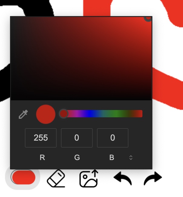
결과

댓글남기기